- Flexera Community
- :
- Community Hub
- :
- Flexera Engineering Blog
- :
- Balancing design constraints and developer experience in React Component Libraries
- Subscribe to RSS Feed
- Mark as New
- Mark as Read
- Subscribe
- Printer Friendly Page
- Report Inappropriate Content
One of the greatest challenges for Flexera's UI developers has been writing frontends that look and behave consistently across the entire product portfolio. In 2019, Flexera's UI and UX teams have worked in collaboration to release a comprehensive suite of React components that can be used to unify the company's products.
During our research phase, it became apparent that we wanted to enable some kind of 'Constrained Flexibility' in these components. It is relatively straightforward to release a set of components with pre-defined styles that cannot be changed in an effort to maintain consistency. The problem with this approach is that it breaks down the first time a developer needs to do something slightly different with a component. A good example is the rare (but realistic) need to adjust the margin on a piece of typography. With a predefined set of typography components, there is no way to achieve this, short of adjusting the margin globally - across all usages, thus, our developer experience suffers.
At Flexera we took a holistic approach to this problem, and decided to create components with 'guard-rails'. The goal was to have components that looked great and were brand consistent when used out-of-the-box, but would allow developers to make constrained tweaks where necessary, without the need to understand the component's source code.
Styled-Components
A technology that we had previously settled on was styled-components. This CSS-in-JS library allows us to inject styles into the head tag of HTML documents when a component is mounted. This was a natural choice for the component library since it meant that we could reliably bundle and ship our styles directly with the component code.
Another important strength was theme support. Any 'styled-component' can use values from a Flexera theme developed by the UX team. The theme is passed to every component in an application via the React Context API, allowing us to switch it at runtime if necessary.
The snippet below shows how we might declare a branded 'H2' component using 'styled-components'. Note how all of the values are extracted from the 'theme' object, which is passed via props.
import styled from 'styled-components';

const H2 = styled.h2`
	${({ theme }) => `
      font-family: ${theme.fontFamily.primary};
      font-size: ${theme.fontSize.xlg};
      fontWeight: ${theme.fontWeight.bold};
      lineHeight: ${theme.lineHeight.md};
      letterSpacing: ${theme.letterSpacing.md};
      margin-bottom: ${theme.space.xlg};
      color: ${theme.color.grey[6]};
  `}
`;

render(
  <H2>A Visually Consistent H2</H2>
);
The 'theme' object is ultimately just a large collection of keys and values, arranged in an idiomatic way, a snippet from the Flexera theme file:
const BaseTheme = {
	space: {
		xxs: '0.2rem',
		xs: '0.3rem',
		sm: '0.5rem',
		md: '0.75rem',
		lg: '1rem',
		xlg: '2rem',
		xxlg: '3rem',
	},
	fonts: {
		primary: 'Nunito, helvetica, arial, sans-serif',
		secondary: 'Source Sans Pro, helvetica, arial, sans-serif',
	},
	fontSizes: {
		xxs: '0.75rem',
		xs: '0.875rem',
		sm: '0.9375rem',
		md: '1.125rem',
		lg: '1.375rem',
		xlg: '1.875rem',
		xxlg: '2.5rem',
	},
	fontWeights: {
		regular: 400,
		semiBold: 600,
		bold: 700,
	},
	radii: {
		sm: '0.1rem',
		md: '0.35rem',
		lg: '0.5rem',
		xlg: '1.5rem',
	},
	borders: {
		sm: '1px solid',
		md: '2px solid',
		lg: '4px solid',
	},
	colors: {
		primary: '#00549F',
		secondary: '#DDDDDD',
		tertiary: '#00A1DE',
		destructive: '#C32525',
		grey: [
			'#F8F8F8',
			'#F1F1F1',
			'#DDDDDD',
			'#C1C1C1',
			'#9B9B9B',
		],
    ...
	},
  ...
};
Defining a single theme this way enables future style adjustments to be low-risk and to be propagated through all components that need them.
At this point, we have successfully created an updatable, brand-consistent typography component - but what if our developer needs to adjust the margin like we were talking about earlier?
...
letterSpacing: ${theme.letterSpacing.md};
margin-bottom: ${theme.space.xlg};
color: ${theme.color.grey[6]};
...
The 'margin-bottom' property has been locked to the 'medium' letter-spacing value defined in our theme, and cannot be changed. We could pass custom props through that would allow developers to tweak this value, but this becomes cumbersome and doesn't scale well if we plan to allow many of the styles to be overridable.
Styled-System
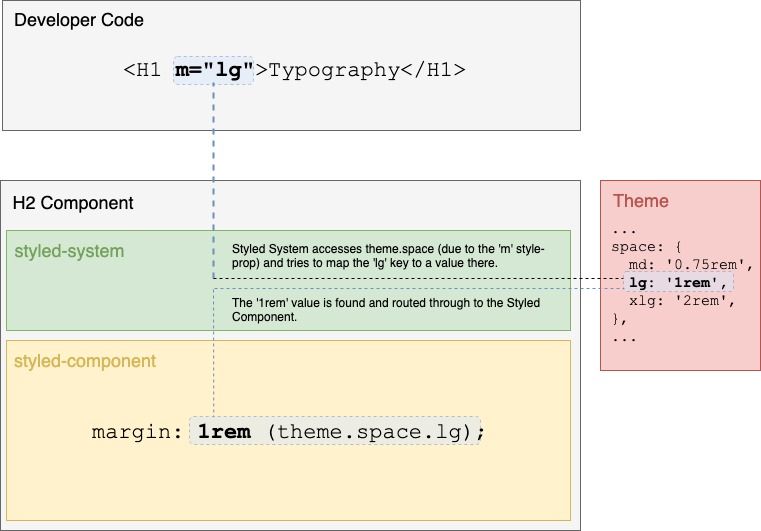
The solution to our problem was styled-system. This library acts as a layer on top of 'styled-components' and allows for 'Style Props' to be used.
A 'Style Prop' is any prop that maps directly to a CSS property. For instance, if a developer wanted to adjust the 'H2' component's margin, we can use the shorthand 'm' Style Prop:
render(
  <H2 m="xxlg">I have a very large margin</H2>
)
In this case, we have overridden the default 'margin-bottom' in the 'styled-component' with our own value. Values can map directly to keys in the theme file ('xxlg', 'primary', 'md') or for some cases, it makes sense to use explicit values ('100px', '1rem').
To expose 'Style-Props' on components for developers to use, we need to adjust our snippet as follows:
import styled from 'styled-components';
import { space, color, layout } from 'styled-system';

const H2 = styled.h2`
  ${space}
  ${color}
  ${layout}

  ${({ theme }) => `
      font-family: ${theme.fontFamily.primary};
      font-size: ${theme.fontSize.xlg};
      fontWeight: ${theme.fontWeight.bold};
      lineHeight: ${theme.lineHeight.md};
      letterSpacing: ${theme.letterSpacing.md};
      margin-bottom: ${theme.space.xlg};
      color: ${theme.color.grey[6]};
  `}
`;

render(
  <H2 m="xxlg">A Visually Consistent H2</H2>
);
We import the 'space', 'color' and 'layout' Style-Prop sets from 'styled-system' and inject them into the 'H2' declaration. Each set contains properties that developers can now set or override from the JSX level.
The Complete Solution
This combination allows us to have the core building blocks that we need for our applications, while retaining the ability to make stylistic tweaks where we need to. This approach has sped up prototyping cycles, decreased developer on-boarding time, and centralised our component codebase in a way that makes it easier to release bug fixes.
Further Reading
You must be a registered user to add a comment. If you've already registered, sign in. Otherwise, register and sign in.

